2025Branding · Packaging · Campaign · FMCG
SELTIK
Branding, packaging & campaign art
Fictional energy drink for 18-40 tech workers: high-contrast identity, can design, and campaign banners built around focus over hype.
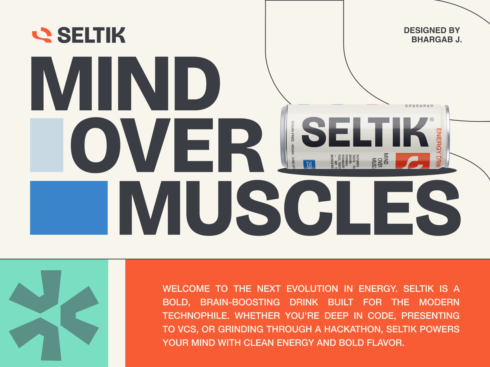
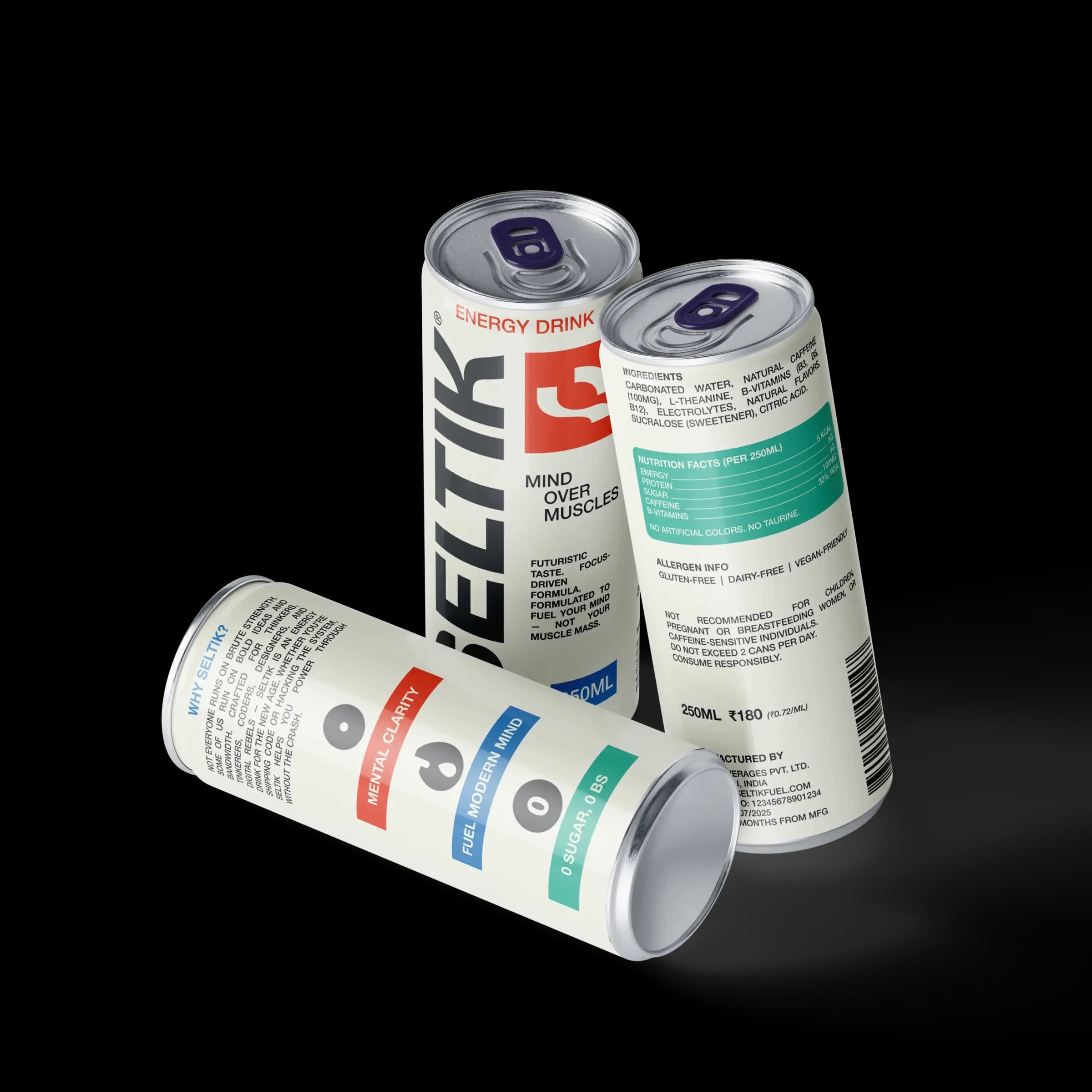
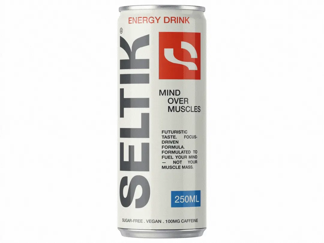
SELTIK is a fictional energy drink brand I built in 2025 for people who live in terminals, Figma files, and late-night deploys. The audience is 18–40, mostly in tech and IT: developers, designers, and founders who want caffeine without the loud gym-energy cliché. The positioning is simple. Mind over muscles.
Brand direction
The identity stays brutal and readable: white wordmark, geometric mark, and a red-first palette that reads like alert mode, not sports drink neon. Campaign art pushes macro texture (liquid, ice, eye, condensation) so the brand feels intense up close and still works as a small logo in a navbar or on a can.
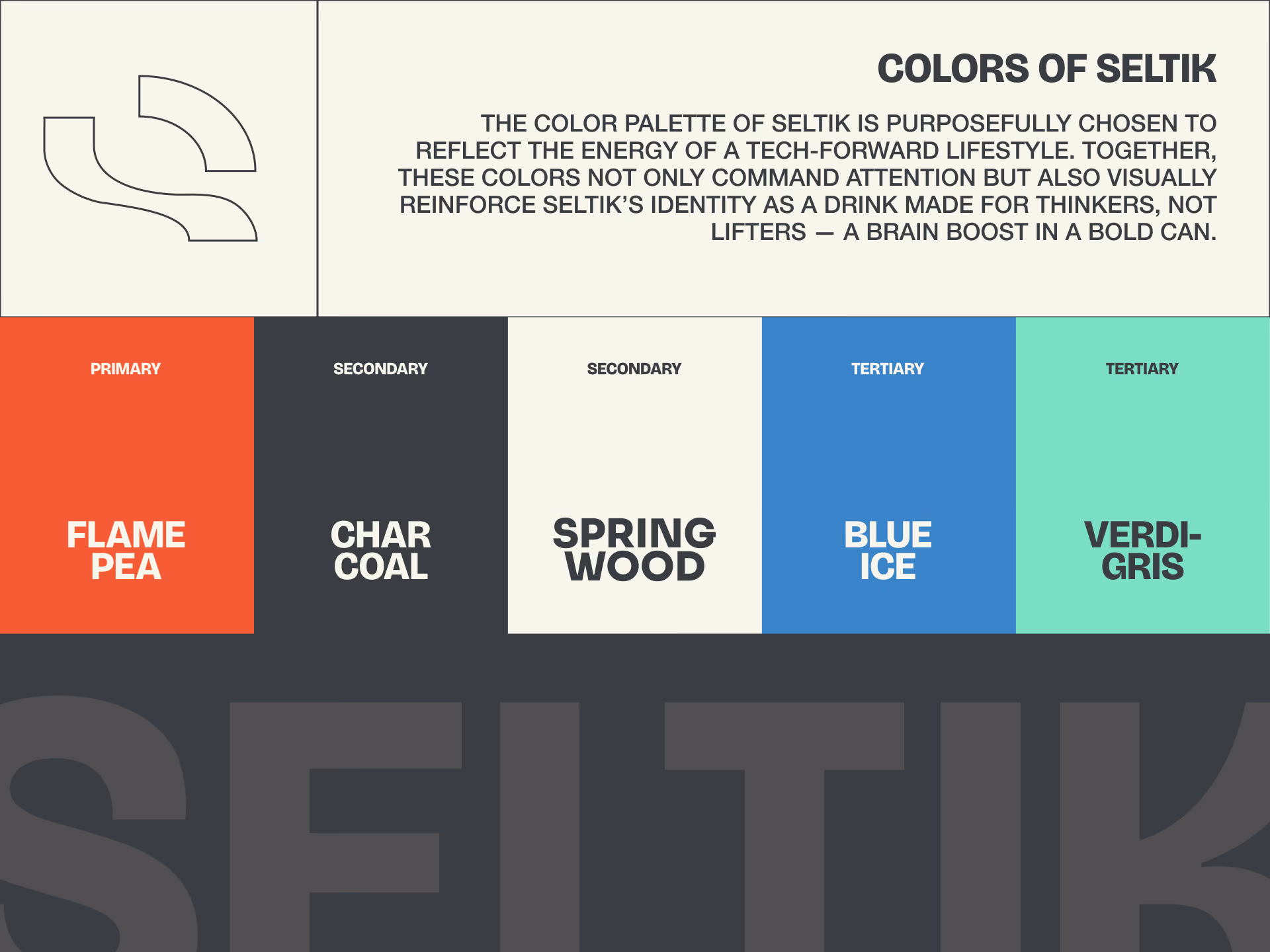
Color and type
Core colors are deep red, black, and off-white, with blue and teal accents on pack for nutrition callouts. Typography is a heavy geometric sans: all caps for impact, tight tracking on SELTIK, lighter weights for supporting lines like ENERGY DRINK and product claims.
Visual system
Secondary graphics use grain, high contrast, and circular motifs (bubbles, rings, ripples) so every touchpoint feels cold, sharp, and a little industrial. The mark reads as motion and focus without leaning on lightning bolts or wings.
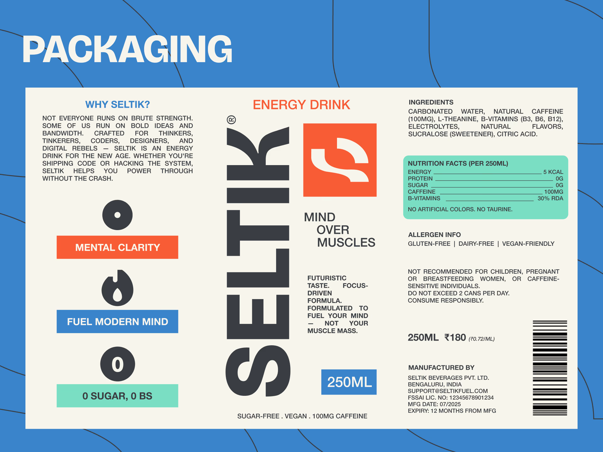
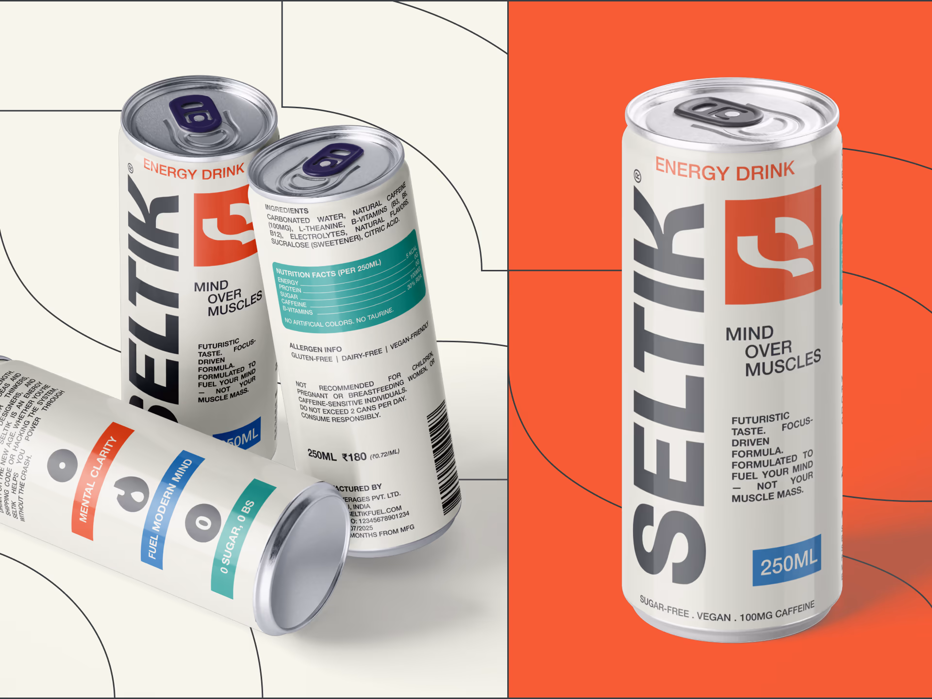
Packaging
The 250ml slim can is built for shelves and desk fridges: vertical SELTIK, red icon block, and copy aimed at thinkers. Mind over muscles on the front. Back panel carries a clean nutrition stack (100mg caffeine, L-theanine, B vitamins, zero sugar) and a short manifesto for coders and digital rebels. No taurine, no artificial colors, vegan-friendly lines for the label nerds.
Motion
A short animated treatment carries the mark through liquid and light shifts so the brand can live in social cuts, launch stingers, and OOH loops without redoing the static system.
Gallery
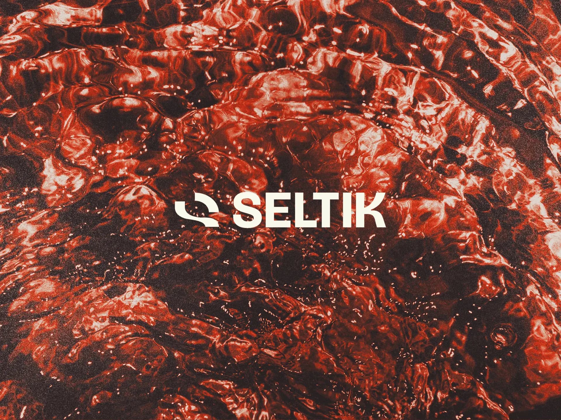
Campaign banner — liquid texture 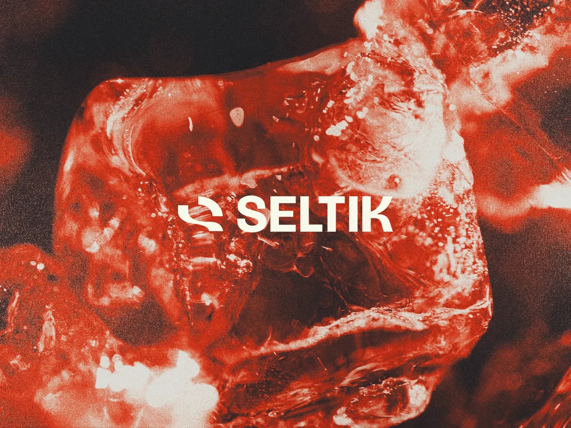
Campaign banner — ice macro 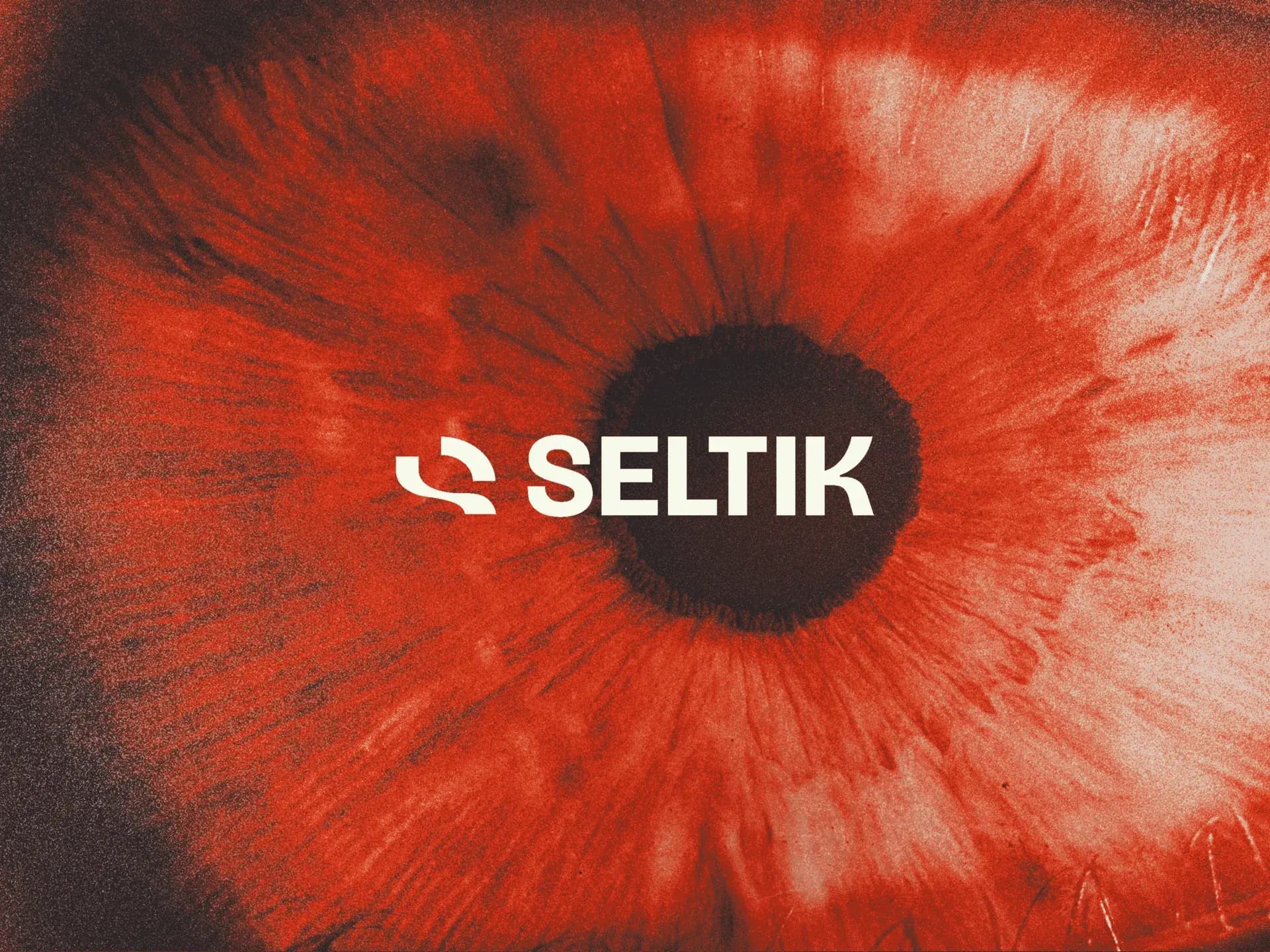
Campaign banner — focus motif 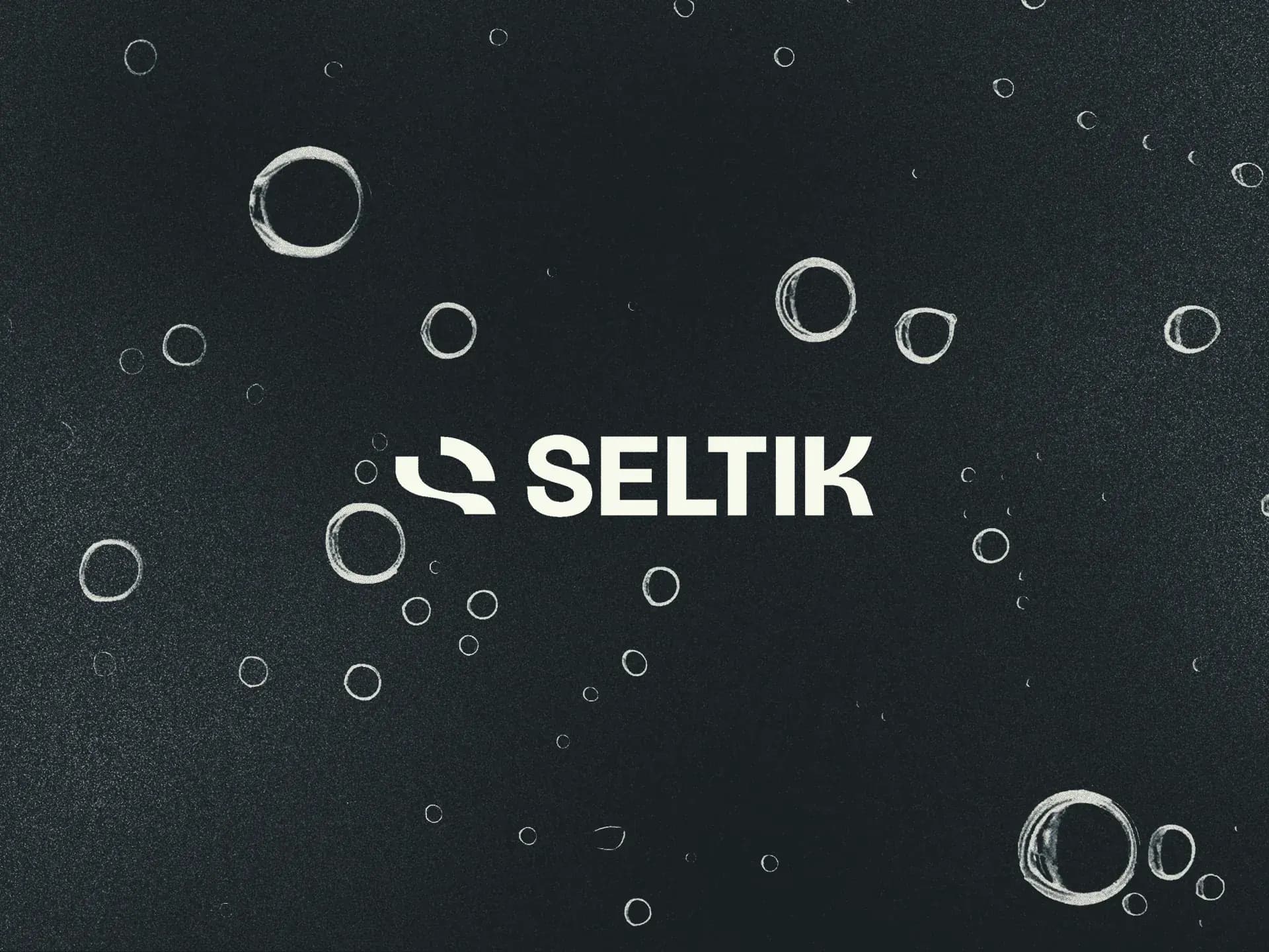
Campaign banner — condensation